Color Theory in Cinematography and Its Narrative Significance

What is Color Theory and Why Does It Matter?
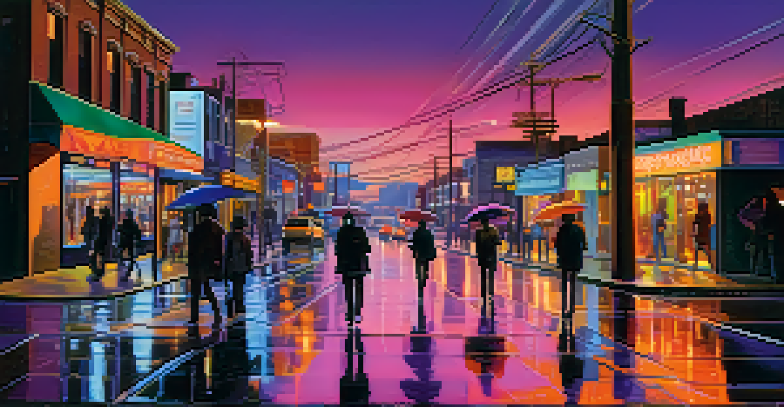
Color theory is a set of principles used to understand how colors interact and affect viewers' emotions. In cinematography, these principles are crucial because they can evoke feelings, set the mood, and even hint at deeper themes within a film. For instance, a film that uses a cold blue palette may evoke feelings of isolation or sadness, while warm reds and yellows can create a sense of warmth and comfort.
Color is the keyboard, the eyes are the harmonies, the soul is the piano with many strings.
By carefully selecting colors, filmmakers can guide the audience's emotional responses without a single word being spoken. This powerful tool helps to establish tone and atmosphere, making color choices integral to the storytelling process. Think of it as a visual language that speaks to the audience in ways dialogue often cannot.
Ultimately, understanding color theory gives filmmakers the ability to manipulate perceptions and create a more immersive experience. It transforms simple scenes into profound moments, enriching the narrative and engaging the viewer's senses.
The Primary Colors: Building Blocks of Emotion
At the heart of color theory are the primary colors—red, blue, and yellow. These colors can be combined in various ways to create a spectrum of emotions and moods. For example, red often symbolizes passion or danger, while blue can represent tranquility or sadness. These associations can vary culturally, adding another layer of complexity to their use in film.
In cinematography, filmmakers often use these primary colors as a foundation for their palettes. By combining them with secondary colors like green and orange, they can create visual hierarchies that draw attention to specific elements within a frame. This technique can highlight a character's emotional state or foreshadow future events in the narrative.
Color Theory Guides Viewer Emotions
Filmmakers use color theory to evoke emotions and enhance storytelling without words.
In essence, primary colors serve as the building blocks for more complex emotional storytelling, allowing filmmakers to craft visually compelling narratives that resonate deeply with audiences.
Color Harmony: Creating a Cohesive Visual Experience
Color harmony refers to the pleasing arrangement of colors in a composition. In cinematography, achieving harmony can elevate the visual storytelling by ensuring that all elements within a scene work together seamlessly. Filmmakers often rely on color schemes, such as complementary or analogous colors, to create visual cohesion.
Colors, like features, follow the changes of the emotions.
For example, a film that employs complementary colors, like blue and orange, can create striking contrasts that draw the viewer's eye and emphasize key moments. On the other hand, analogous colors, which sit next to each other on the color wheel, can create a sense of unity and calmness, perfect for scenes meant to evoke intimacy or nostalgia.
By mastering color harmony, cinematographers can craft visually stunning films that not only tell a story but also create an emotional ambiance that lingers long after the credits roll.
The Psychology of Color: Tapping into Audience Emotions
Colors have a profound psychological impact on viewers, influencing their emotions and perceptions. This is particularly important in cinematography, where the right color choices can enhance or undermine the narrative. Understanding the psychology of color allows filmmakers to make informed decisions about how to evoke specific feelings in their audience.
For instance, green is often associated with nature and growth but can also convey jealousy or decay, depending on the context. A horror film might employ desaturated green hues to create a sense of unease, while a romantic film may use soft pastels to evoke tenderness and warmth.
Primary Colors Shape Emotional Depth
Primary colors serve as foundational elements that filmmakers combine to create complex emotional narratives.
By harnessing the psychological effects of color, filmmakers can create a more engaging and emotionally resonant viewing experience, making the audience feel connected to the story and its characters.
Color Trends in Film: Historical Context and Evolution
Throughout film history, color trends have evolved dramatically, reflecting cultural shifts and advancements in technology. Early films were often black and white, but the introduction of Technicolor in the 1930s opened up new possibilities for visual storytelling. This shift allowed filmmakers to experiment with color in innovative ways, shaping the aesthetic of modern cinema.
In recent years, filmmakers have revisited and reinvented color palettes, drawing on historical influences while adding their unique flair. For example, the use of vibrant color schemes in films like 'La La Land' pays homage to classic musicals while creating a contemporary feel that resonates with today's audience.
Understanding these trends not only provides insight into the artistic choices made by filmmakers but also highlights how color continues to play a vital role in storytelling, adapting to reflect the times and resonating with viewers across generations.
Symbolism and Color: Enhancing Narrative Depth
Color is often used symbolically in film to convey deeper meanings and enhance narrative depth. Filmmakers can use specific colors to represent themes or character arcs, creating visual metaphors that enrich the storytelling. For example, a character dressed in white may symbolize purity or innocence, while a gradual shift to darker colors can signify their descent into moral ambiguity.
By incorporating symbolic colors into their work, filmmakers invite viewers to engage with the story on a more profound level. This technique encourages audiences to look beyond the surface and explore the underlying messages conveyed through color choices.
Symbolism Deepens Narrative Impact
Colors in film often symbolize deeper meanings, inviting audiences to explore themes and character arcs more profoundly.
In this way, color becomes a narrative device in itself, adding layers of complexity and encouraging viewers to interpret the story through a unique lens.
Case Studies: Iconic Films and Their Color Choices
Several iconic films have masterfully employed color theory to enhance their narratives. Take 'The Grand Budapest Hotel,' for instance; its pastel color palette not only creates a whimsical atmosphere but also reflects the film's themes of nostalgia and loss. The vibrant colors draw viewers into a stylized world, while also highlighting the emotional undercurrents within the story.
Another great example is 'Mad Max: Fury Road,' where the stark contrast between the arid desert landscape and the vibrant colors of the characters' costumes amplifies the film's intensity. The use of color not only serves to differentiate characters but also elevates the adrenaline-pumping action sequences, making them unforgettable.

These case studies illustrate how effective color choices can transform a film from ordinary to extraordinary, demonstrating the power of color theory in cinematography and its ability to resonate with audiences on multiple levels.